Building a Foreclosure Map
As a fan of data, I track foreclosure numbers as a hobby. Last month, nation wide default notices off by 27 percent, but bank repossessions set new monthly record. I don’t have any more detailed and recent data to plot an interactivity map like the one on NPR, but I managed to find some data from Q3 2009 on RealtyTrac. Let’s see how easy it is to build a map using Report Builder 3.0.
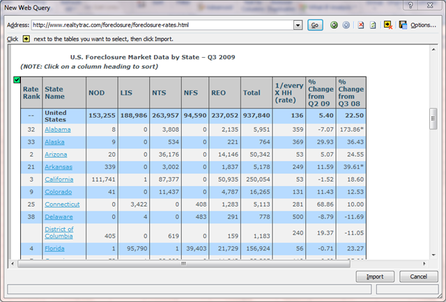
First, we’ll download the data from the source. Start Microsoft Excel and go to “Data”—>”From Web” and enter the URL in the address bar: http://www.realtytrac.com/foreclosure/foreclosure-rates.html. Scroll down to the “US Foreclosure Market Data by State – Q3 2009” table. Click on the arrow to select the table and import data.
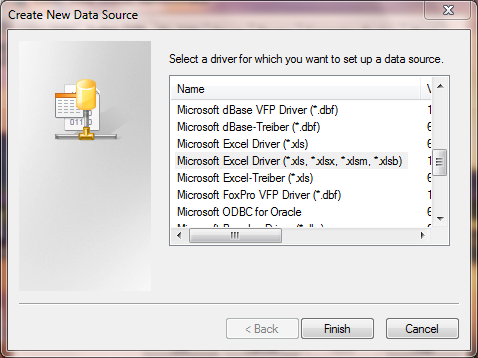
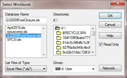
Second, save the file as an Excel 2000-2003 work book on disc, say, as Q32009ForeClosure.xls on D:\. Create a system data source named “Foreclosure” pointed to this file.
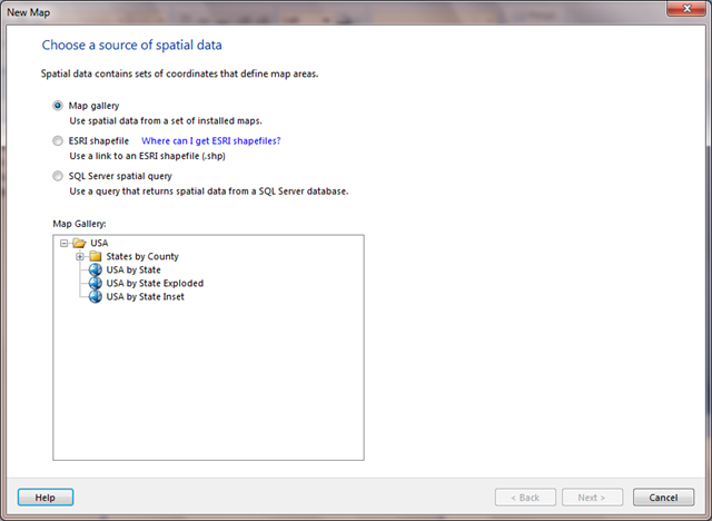
Now, we can launch Report Builder 3.0 to start the Map Wizard. Select “USA by State Inset”. Select defaults on next screen.
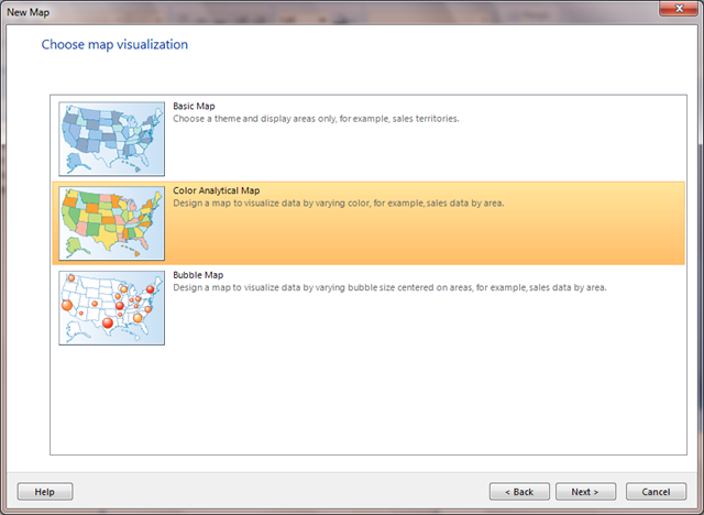
And pick Color Analytical Map on next screen.
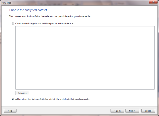
Add a new analytical dataset based on data source “Foreclosure”
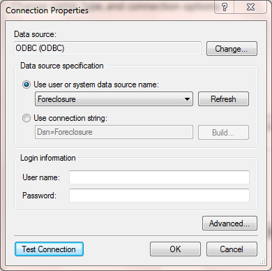
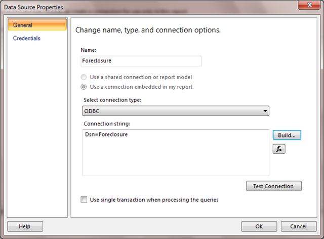
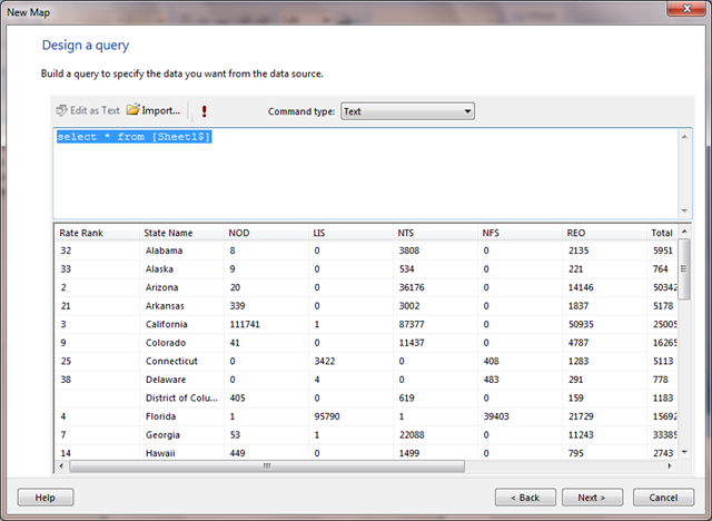
Run query “select * from [Sheet1$] to make sure that it works.
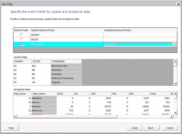
And specify the matching fields for spatial and analytical data. In this case, the field in spatial dataset is “STATENAME” and the field in analytical dataset is “State_Name”.
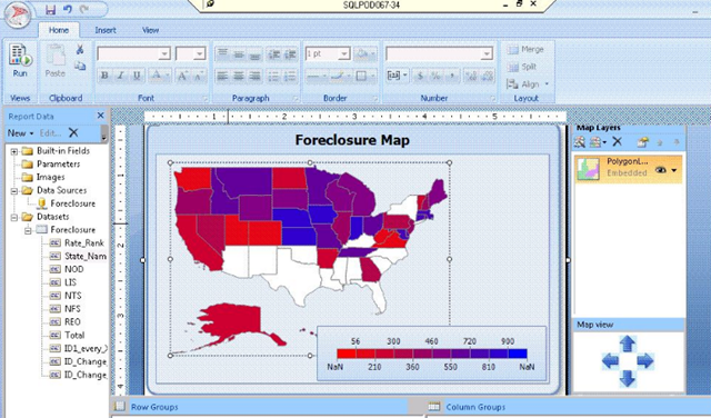
Pick the theme, as well as the field to visualize, and the color rule. Get rid of the legends etc and leave only the color scale on the map. Add title “Foreclosure Map”.
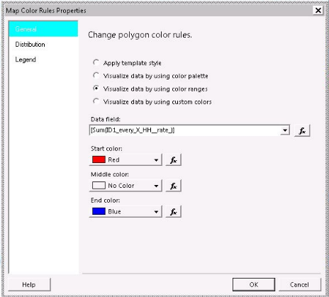
Click on the map, a property panel will show up on the RHS. Right click on “Polygon Layer” and select “Polygon Color Rule”. Make sure that the correct data field is picked, start and end colors are right. In the case we have, we’ll start with something red and end it with blue as the smaller the number, the more severe foreclosure condition is in the state. Change the “Distribution” to have 10 subranges, with them starting at 0 and ending at 3000.
Want to see some tooltips? Go to “Polygon Properties”—>”General” and add it there. Let’s add something like
1: ="In "+ Fields!State_Name.Value + ",1 in every " + Fields!ID1_every_X_HH__rate_.Value.ToString() + " house is in some stage of foreclosure process."
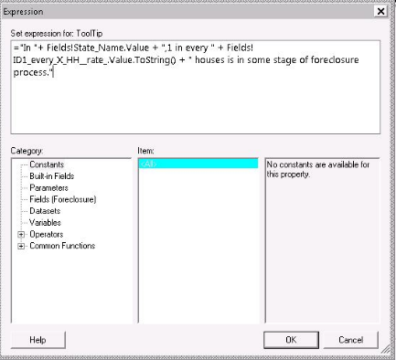
Hit the “Run” button to get a preview. Hover the mouse on some of the states to check out the tooltips.
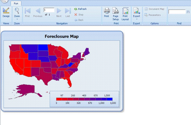
In less than five minutes, we build this colorful map visualizing the foreclosure conditions in different states across the US. The completed RDL file along with the Excel data file is available in archived format here.
Data Reference
Thanks. This is exactly what I need for a RE report.